Warning: package 'dslabs' was built under R version 4.4.3
library("dplyr")
Warning: package 'dplyr' was built under R version 4.4.3
Attaching package: 'dplyr'
The following objects are masked from 'package:stats':

    filter, lag
The following objects are masked from 'package:base':

    intersect, setdiff, setequal, union
library("ggplot2")
Warning: package 'ggplot2' was built under R version 4.4.3
# get an overview of data structurestr(gapminder)
'data.frame':   10545 obs. of  9 variables:
 $ country         : Factor w/ 185 levels "Albania","Algeria",..: 1 2 3 4 5 6 7 8 9 10 ...
 $ year            : int  1960 1960 1960 1960 1960 1960 1960 1960 1960 1960 ...
 $ infant_mortality: num  115.4 148.2 208 NA 59.9 ...
 $ life_expectancy : num  62.9 47.5 36 63 65.4 ...
 $ fertility       : num  6.19 7.65 7.32 4.43 3.11 4.55 4.82 3.45 2.7 5.57 ...
 $ population      : num  1636054 11124892 5270844 54681 20619075 ...
 $ gdp             : num  NA 1.38e+10 NA NA 1.08e+11 ...
 $ continent       : Factor w/ 5 levels "Africa","Americas",..: 4 1 1 2 2 3 2 5 4 3 ...
 $ region          : Factor w/ 22 levels "Australia and New Zealand",..: 19 11 10 2 15 21 2 1 22 21 ...
# get a summary of datasummary(gapminder)
                country           year      infant_mortality life_expectancy
 Albania            :   57   Min.   :1960   Min.   :  1.50   Min.   :13.20
 Algeria            :   57   1st Qu.:1974   1st Qu.: 16.00   1st Qu.:57.50
 Angola             :   57   Median :1988   Median : 41.50   Median :67.54
 Antigua and Barbuda:   57   Mean   :1988   Mean   : 55.31   Mean   :64.81
 Argentina          :   57   3rd Qu.:2002   3rd Qu.: 85.10   3rd Qu.:73.00
 Armenia            :   57   Max.   :2016   Max.   :276.90   Max.   :83.90
 (Other)            :10203                  NA's   :1453
   fertility       population             gdp               continent
 Min.   :0.840   Min.   :3.124e+04   Min.   :4.040e+07   Africa  :2907
 1st Qu.:2.200   1st Qu.:1.333e+06   1st Qu.:1.846e+09   Americas:2052
 Median :3.750   Median :5.009e+06   Median :7.794e+09   Asia    :2679
 Mean   :4.084   Mean   :2.701e+07   Mean   :1.480e+11   Europe  :2223
 3rd Qu.:6.000   3rd Qu.:1.523e+07   3rd Qu.:5.540e+10   Oceania : 684
 Max.   :9.220   Max.   :1.376e+09   Max.   :1.174e+13
 NA's   :187     NA's   :185         NA's   :2972
             region
 Western Asia   :1026
 Eastern Africa : 912
 Western Africa : 912
 Caribbean      : 741
 South America  : 684
 Southern Europe: 684
 (Other)        :5586
# determine the type of object gapminder isclass(gapminder)
[1] "data.frame"
africadata <- gapminder %>%filter(continent =="Africa")# Create a new data frame with only 'infant_mortality' and 'life_expectancy'africa_mort_life <- africadata %>%select(infant_mortality, life_expectancy)# Create another data frame with only 'population' and 'life_expectancy'africa_pop_life <- africadata %>%select(population, life_expectancy)# Check the structure of the first new objectstr(africa_mort_life)
'data.frame':   2907 obs. of  2 variables:
 $ infant_mortality: num  148 208 187 116 161 ...
 $ life_expectancy : num  47.5 36 38.3 50.3 35.2 ...
# Check a summary of the data to understand distributions and NA presencesummary(africa_mort_life)
 infant_mortality life_expectancy
 Min.   : 11.40   Min.   :13.20
 1st Qu.: 62.20   1st Qu.:48.23
 Median : 93.40   Median :53.98
 Mean   : 95.12   Mean   :54.38
 3rd Qu.:124.70   3rd Qu.:60.10
 Max.   :237.40   Max.   :77.60
 NA's   :226
# Check the structure of the second new objectstr(africa_pop_life)
'data.frame':   2907 obs. of  2 variables:
 $ population     : num  11124892 5270844 2431620 524029 4829291 ...
 $ life_expectancy: num  47.5 36 38.3 50.3 35.2 ...
# Summary of population and life expectancysummary(africa_pop_life)
   population        life_expectancy
 Min.   :    41538   Min.   :13.20
 1st Qu.:  1605232   1st Qu.:48.23
 Median :  5570982   Median :53.98
 Mean   : 12235961   Mean   :54.38
 3rd Qu.: 13888152   3rd Qu.:60.10
 Max.   :182201962   Max.   :77.60
 NA's   :51
I created two new data frames from the “africadata” object:
- “africa_mort_life”: Contains only the “infant_mortality” and “life_expectancy” columns. - “africa_pop_life”: Contains only the “population” and “life_expectancy” columns.
Both data frames contain 2907 rows (one for each African country-year observation) and 2 columns. I used str() to inspect the structure (data types and column names) and summary() to examine the distribution and detect missing values.
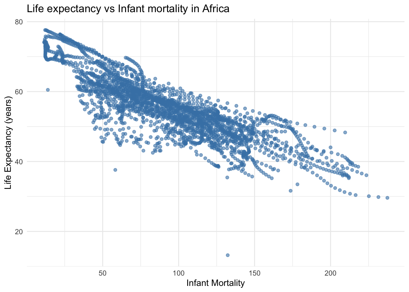
# Load dplyr packagelibrary(dplyr)# Create the object with infant_mortality and life_expectancyafrica_mort_life <- africadata %>%select(infant_mortality, life_expectancy)# Plotting Life expectancy vs infant mortality ggplot(africa_mort_life, aes(x = infant_mortality, y = life_expectancy)) +geom_point(alpha =0.6, color ="steelblue") +labs(title ="Life expectancy vs Infant mortality in Africa",x ="Infant Mortality",y ="Life Expectancy (years)" ) +theme_minimal()
Warning: Removed 226 rows containing missing values or values outside the scale range
(`geom_point()`).
This plot shows a negative correlation between infant mortality and life expectancy. Countries with higher infant mortality tend to have lower life expectancy.
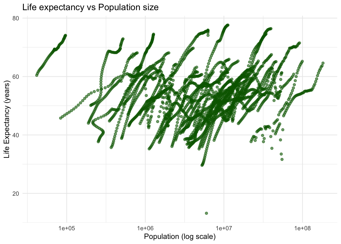
# Create population vs life expectancy data from africadataafrica_pop_life <- africadata %>%select(population, life_expectancy)# Plotting Life expectancy vs pop size ggplot(africa_pop_life, aes(x = population, y = life_expectancy)) +geom_point(alpha =0.6, color ="darkgreen") +scale_x_log10() +# log scale for populationlabs(title ="Life expectancy vs Population size",x ="Population (log scale)",y ="Life Expectancy (years)" ) +theme_minimal()
Warning: Removed 51 rows containing missing values or values outside the scale range
(`geom_point()`).
Here, we observe a positive correlation between population size and life expectancy.
However, the data displays streaks of points. When we examine the original africadata again, we notice that each country has multiple entries over time (from 1960 to 2016). These streaks represent temporal data points for each country, where each streak corresponds to a single country progressing over time.
# Now perform analysis for year 20000africadata_year2000 <-subset(africadata, year ==2000)# get an overview of data structurestr(africadata_year2000)
'data.frame':   51 obs. of  9 variables:
 $ country         : Factor w/ 185 levels "Albania","Algeria",..: 2 3 18 22 26 27 29 31 32 33 ...
 $ year            : int  2000 2000 2000 2000 2000 2000 2000 2000 2000 2000 ...
 $ infant_mortality: num  33.9 128.3 89.3 52.4 96.2 ...
 $ life_expectancy : num  73.3 52.3 57.2 47.6 52.6 46.7 54.3 68.4 45.3 51.5 ...
 $ fertility       : num  2.51 6.84 5.98 3.41 6.59 7.06 5.62 3.7 5.45 7.35 ...
 $ population      : num  31183658 15058638 6949366 1736579 11607944 ...
 $ gdp             : num  5.48e+10 9.13e+09 2.25e+09 5.63e+09 2.61e+09 ...
 $ continent       : Factor w/ 5 levels "Africa","Americas",..: 1 1 1 1 1 1 1 1 1 1 ...
 $ region          : Factor w/ 22 levels "Australia and New Zealand",..: 11 10 20 17 20 5 10 20 10 10 ...
# summary of datasummary(africadata_year2000)
         country        year      infant_mortality life_expectancy
 Algeria     : 1   Min.   :2000   Min.   : 12.30   Min.   :37.60
 Angola      : 1   1st Qu.:2000   1st Qu.: 60.80   1st Qu.:51.75
 Benin       : 1   Median :2000   Median : 80.30   Median :54.30
 Botswana    : 1   Mean   :2000   Mean   : 78.93   Mean   :56.36
 Burkina Faso: 1   3rd Qu.:2000   3rd Qu.:103.30   3rd Qu.:60.00
 Burundi     : 1   Max.   :2000   Max.   :143.30   Max.   :75.00
 (Other)     :45
   fertility       population             gdp               continent
 Min.   :1.990   Min.   :    81154   Min.   :2.019e+08   Africa  :51
 1st Qu.:4.150   1st Qu.:  2304687   1st Qu.:1.274e+09   Americas: 0
 Median :5.550   Median :  8799165   Median :3.238e+09   Asia    : 0
 Mean   :5.156   Mean   : 15659800   Mean   :1.155e+10   Europe  : 0
 3rd Qu.:5.960   3rd Qu.: 17391242   3rd Qu.:8.654e+09   Oceania : 0
 Max.   :7.730   Max.   :122876723   Max.   :1.329e+11

                       region
 Eastern Africa           :16
 Western Africa           :16
 Middle Africa            : 8
 Northern Africa          : 6
 Southern Africa          : 5
 Australia and New Zealand: 0
 (Other)                  : 0
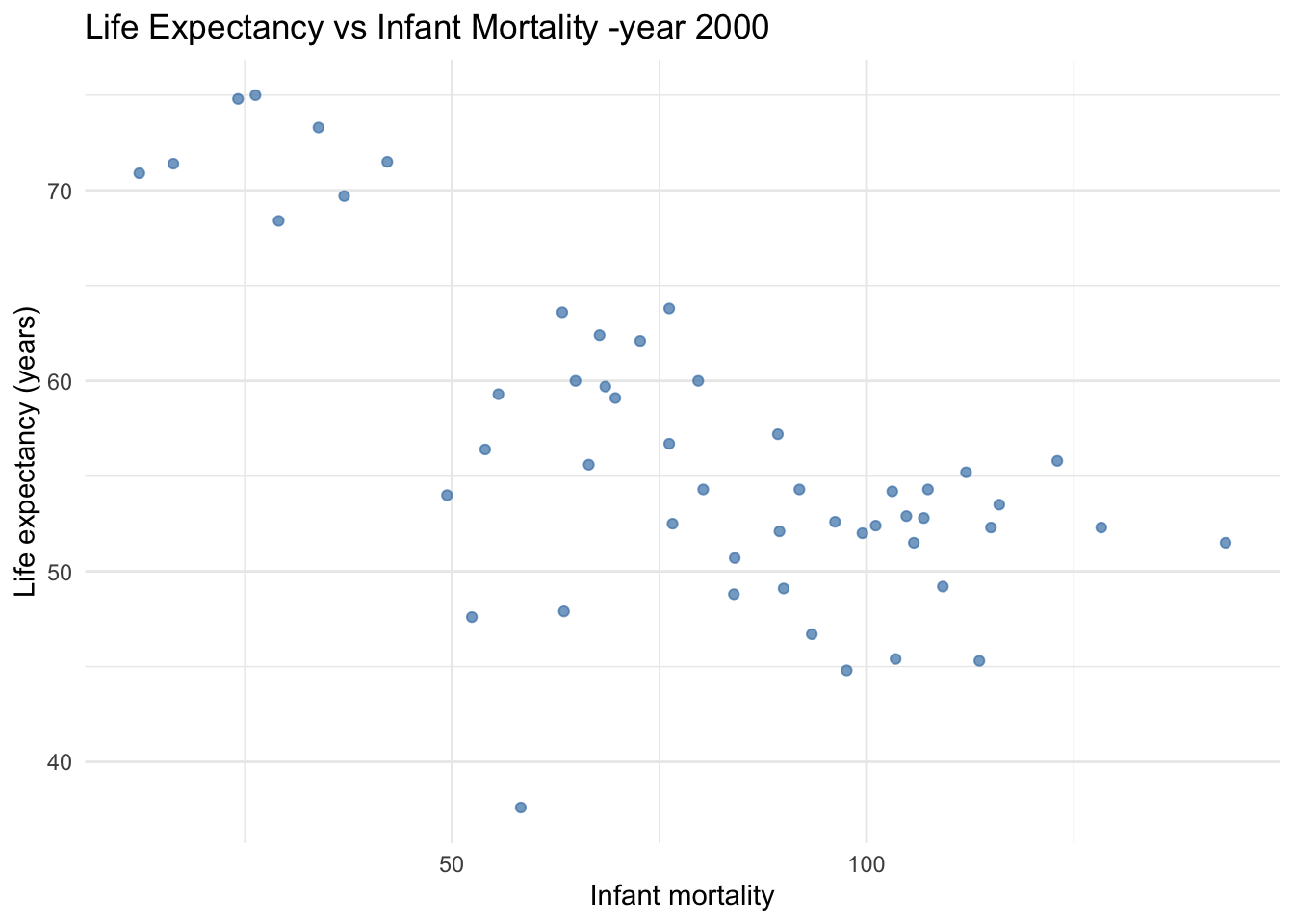
# Now we will apply models to our analysis of year 2000 to see if they are significant correlations:# Model 1: Predict life expectancy using infant mortalityfit1 <-lm(life_expectancy ~ infant_mortality, data = africadata_year2000)# Model 2: Predict life expectancy using population sizefit2 <-lm(life_expectancy ~ population, data = africadata_year2000)# Print model summaries to screensummary(fit1)
Call:
lm(formula = life_expectancy ~ infant_mortality, data = africadata_year2000)

Residuals:
     Min       1Q   Median       3Q      Max
-22.6651  -3.7087   0.9914   4.0408   8.6817

Coefficients:
                 Estimate Std. Error t value Pr(>|t|)
(Intercept)      71.29331    2.42611  29.386  < 2e-16 ***
infant_mortality -0.18916    0.02869  -6.594 2.83e-08 ***
---
Signif. codes:  0 '***' 0.001 '**' 0.01 '*' 0.05 '.' 0.1 ' ' 1

Residual standard error: 6.221 on 49 degrees of freedom
Multiple R-squared:  0.4701,    Adjusted R-squared:  0.4593
F-statistic: 43.48 on 1 and 49 DF,  p-value: 2.826e-08
lm(formula = life_expectancy ~ infant_mortality, data = africadata_year2000)
Call:
lm(formula = life_expectancy ~ population, data = africadata_year2000)

Residuals:
    Min      1Q  Median      3Q     Max
-18.429  -4.602  -2.568   3.800  18.802

Coefficients:
             Estimate Std. Error t value Pr(>|t|)
(Intercept) 5.593e+01  1.468e+00  38.097   <2e-16 ***
population  2.756e-08  5.459e-08   0.505    0.616
---
Signif. codes:  0 '***' 0.001 '**' 0.01 '*' 0.05 '.' 0.1 ' ' 1

Residual standard error: 8.524 on 49 degrees of freedom
Multiple R-squared:  0.005176,  Adjusted R-squared:  -0.01513
F-statistic: 0.2549 on 1 and 49 DF,  p-value: 0.6159
lm(formula = life_expectancy ~ population, data = africadata_year2000)
Call:
lm(formula = life_expectancy ~ population, data = africadata_year2000)

Coefficients:
(Intercept)   population
  5.593e+01    2.756e-08
I fitted two simple linear regression models using the lm() function on African countries in the year 2000:
Model 1 (fit1): Life expectancy as a function of infant mortality. - The model shows a negative correlation between infant mortality and life expectancy. - The estimate for infant mortality is negative and statistically significant (very low p-value), which confirms this inverse relationship.
Model 2 (fit2): Life expectancy as a function of population size. - This model shows not a strong correlation between population size and life expectancy. - The p-value and r-quared are not significant.
In the year 2000, infant mortality is a stronger predictor of life expectancy than population size, at least in the year 2000 in Africa.
# Additional Data Exploration – this part was contributed by Talia C. Swansonlibrary(dslabs)library(dplyr)library(ggplot2)# Upload chosen datasetdata("historic_co2")# Displaying all points in the historic_co2 datasethistoric_co2
# A tibble: 694 × 3
    year   co2 source
   <dbl> <dbl> <chr>
 1  1959  316. Mauna Loa
 2  1960  317. Mauna Loa
 3  1961  318. Mauna Loa
 4  1962  318. Mauna Loa
 5  1963  319. Mauna Loa
 6  1964  320. Mauna Loa
 7  1965  320. Mauna Loa
 8  1966  321. Mauna Loa
 9  1967  322. Mauna Loa
10  1968  323. Mauna Loa
# ℹ 684 more rows
The str( ) function shows the structure of the historic_co2 dataset. It has 694 total observations and 3 variables, year – the year of measurement co2 – the CO₂ concentration source – the measurement source
This helps us understand the type of data we’re working with and confirms that the dataset is ready for analysis and visualization.
# You will preview beginning data and look at your descriptive statshead(historic_co2)
# A tibble: 6 × 3
   year   co2 source
  <dbl> <dbl> <chr>
1  1959  316. Mauna Loa
2  1960  317. Mauna Loa
3  1961  318. Mauna Loa
4  1962  318. Mauna Loa
5  1963  319. Mauna Loa
6  1964  320. Mauna Loa
summary(historic_co2)
      year              co2           source
 Min.   :-803182   Min.   :177.7   Length:694
 1st Qu.:-470498   1st Qu.:206.7   Class :character
 Median : -43278   Median :236.9   Mode  :character
 Mean   :-219753   Mean   :245.9
 3rd Qu.:  -8924   3rd Qu.:271.8
 Max.   :   2018   Max.   :408.5
The head( ) function displays the first 6 rows of the dataset. From this, we can see that CO₂ concentrations start around 316 ppm in 1959 from Mauna Loa and that measurements are chronological.
The summary( ) function provides descriptive statistics for each variable we have, year, source, and co2 concentration.
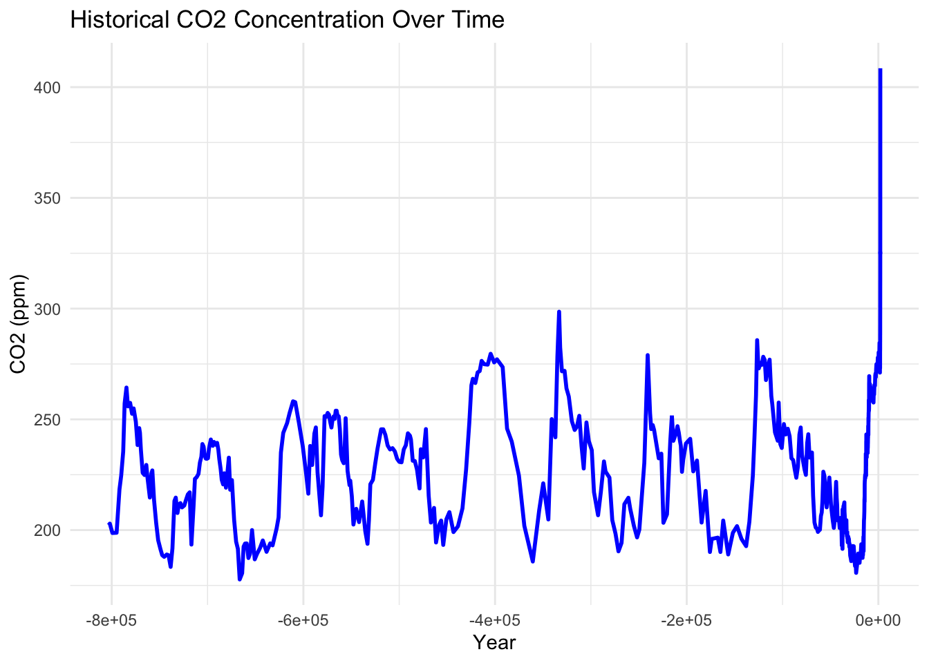
# Plotting CO2 concentration over all timeggplot(historic_co2, aes(x = year, y = co2)) +geom_line(color ="blue", size =1) +labs(title ="Historical CO2 Concentration Over Time",x ="Year",y ="CO2 (ppm)") +theme_minimal()
Warning: Using `size` aesthetic for lines was deprecated in ggplot2 3.4.0.
ℹ Please use `linewidth` instead.
The historic_co2 dataset contains atmospheric CO₂ concentrations measured over time with the first table showing the first few observations within the dataset. Within this visualization, CO₂ concentrations have increased steadily from the mid 1900’s onward. There are small fluctuations of increasing and decreasing behavior throughout the years, however, the general trend is moving upwards indictaing a long-term rise in atmospheric CO₂ levels.
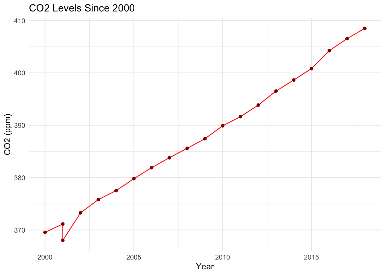
# Filter for recent years 2000 onwards as targetrecent_co2 <- historic_co2 %>%filter(year >=2000)# Display the table of points used in the plot (for recent years)recent_co2
# A tibble: 20 × 3
    year   co2 source
   <dbl> <dbl> <chr>
 1  2000  370. Mauna Loa
 2  2001  371. Mauna Loa
 3  2002  373. Mauna Loa
 4  2003  376. Mauna Loa
 5  2004  378. Mauna Loa
 6  2005  380. Mauna Loa
 7  2006  382. Mauna Loa
 8  2007  384. Mauna Loa
 9  2008  386. Mauna Loa
10  2009  387. Mauna Loa
11  2010  390. Mauna Loa
12  2011  392. Mauna Loa
13  2012  394. Mauna Loa
14  2013  397. Mauna Loa
15  2014  399. Mauna Loa
16  2015  401. Mauna Loa
17  2016  404. Mauna Loa
18  2017  407. Mauna Loa
19  2018  409. Mauna Loa
20  2001  368. Ice Cores
# This will plot our graph of atmospheric CO2 for years 2000 and aboveggplot(recent_co2, aes(x = year, y = co2)) +geom_line(color ="red") +geom_point(color ="darkred") +labs(title ="CO2 Levels Since 2000",x ="Year",y ="CO2 (ppm)") +theme_minimal()
This visualization focuses on CO₂ levels from the year 2000 to the present. During this period, CO₂ concetrations continue to increase at a steady rate without any major decreases or fluctuations. This suggests that atmospheric CO₂ have consistently risen in more recent years.